Design decisions
App design vs ux design: where should you start?
A polished screen and a usable experience are not the same result. App Design separates visual interface work from UX research so you can choose the work your product actually needs.
Total-cost table
The cost of a design decision includes more than drawing screens. Consider the people, evidence and rework needed to reach a decision you can trust.
- app design vs ui design Compare the scope of a complete app design pass with the narrower work of shaping interface elements.
- app design alternative free Review browser-based starting options and the tradeoffs to check before committing to one.
- what is the best app design See which qualities make an app design effective beyond its visual style.
Where quality differs
Visual design improves what people see and operate; UX practice tests whether the overall journey makes sense to them.
-
1
Define the decision
If you already know the audience, task and screen sequence, start by designing the interface: hierarchy, controls, states and readable content. If those assumptions are uncertain, first identify what a person is trying to accomplish and where the current journey fails.
-
2
Make the right artifact
A screen design helps a team inspect layout, visual consistency and interaction details. A UX flow or research finding helps the team decide which screens, steps and explanations belong in the product at all. Neither artifact substitutes for the other.
-
3
Check the outcome
Review visual work for legibility, contrast, touch targets and clear feedback. Check UX assumptions by watching representative people attempt a task, noting hesitation and errors rather than asking only whether they like the appearance.
Where time differs
A design pass can move quickly when the problem is settled. Discovering the right problem takes longer because evidence must come from outside the canvas.
A screen cannot validate demand
This page can help distinguish design scopes, but a convincing interface does not show whether anyone needs the feature. Treat visual approval as feedback on the presentation, not proof of product value.
What to do instead
Speak with prospective users about a recent real task before investing in detailed screens.
A browser workflow is not user research
Exploring app layouts in a browser can clarify ideas and expose missing states. It cannot observe how your intended audience behaves or settle disagreements about their priorities.
What to do instead
Test a simple task flow with representative people and record where they stop or ask for help.
A static view cannot cover every state
A polished main screen may hide difficult cases such as empty results, permission denial, errors and interrupted tasks. Those gaps often affect the experience more than the first impression.
What to do instead
List likely states for each critical task and review them alongside the primary screen.
This comparison does not certify a product
The guidance here is a way to choose your next design activity, not a usability audit or accessibility assessment of a particular app.
What to do instead
Run task-based reviews and accessibility checks on the actual interface before release.
When switching is worth it
Move from screen-focused work to UX investigation when repeated visual revisions fail to resolve confusion about the task itself.
| App design focus | UX design focus | |
|---|---|---|
| Primary question | How should this app look and behave on screen? | Can people accomplish the intended task, and does that task meet a real need? |
| Useful starting evidence | A defined feature, known audience and agreed task flow. | Uncertain user needs, observed friction or competing ideas about the journey. |
| Typical work | Screen hierarchy, components, visual language and interface states. | Research, task analysis, information architecture, flows and usability testing. |
| Common deliverable | Screens and interface specifications that a team can discuss and refine. | Findings, journey maps or tested flows that explain why the interface should work a certain way. |
| Quality check | Review clarity, consistency, accessibility considerations and behavior across states. | Observe whether representative people complete meaningful tasks without avoidable confusion. |
| Time risk | Polishing a screen before its underlying task is settled can create rework. | Research without a specific decision to inform can delay a useful design pass. |
| Best reason to switch | Return to screens once the audience, task and flow are clear enough to express. | Investigate when users cannot find, understand or finish the task despite clearer screens. |
What a change of focus looks like
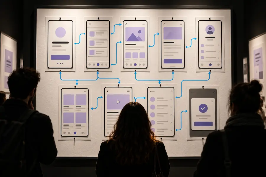

These images illustrate two review perspectives, not a literal before-and-after redesign. A cleaner layout can improve comprehension, but changing the journey may require evidence about users, tasks and obstacles beyond what an image shows.
Inspect the screenInspect the journeyStart with the decision you can make now
Write down who the app serves, what that person needs to finish and what you still do not know. If the journey is uncertain, investigate it first. If the journey is clear, use a browser-based design starting point to explore the interface, then review its states and test the resulting flow with real people.
Put a clear task before a polished screen
- Separate assumptions about users from decisions about appearance.
- Design the main task and its likely error or empty states.
- Use observed task performance to decide what to revise.
Comparison FAQ
App design often refers to shaping an app’s screens, controls, visual system and interaction details. UX design considers the broader experience of completing a task, including research, flow and usability. The two overlap, but a good-looking screen alone does not establish a good experience.
Start with enough understanding of the audience and task to avoid designing the wrong flow. That does not always require a long research phase: a focused conversation or a simple task test may reveal the next decision. Once the task is reasonably clear, screens make the idea easier to examine.
Clear labels, hierarchy and feedback can remove some friction. They cannot fix a journey that asks people to do unnecessary work or hides the action they came to complete. If confusion persists after visual improvements, examine the flow and the assumptions behind it.
It may be enough for an early review when the audience, task and sequence of actions are already understood. Include important states rather than presenting only the ideal screen. Before release, check whether people can actually complete the task.
Switch when feedback keeps raising questions about what users need, which step comes next or why a feature exists. More visual variations are unlikely to answer those questions. Choose a specific uncertainty, gather evidence from representative users and bring the finding back into the design.