Small-screen thinking

Mobile App Design Ideas That Fit Everyday Use

The strongest mobile app design ideas begin with a person trying to do one thing in a particular setting. Pick a moment—checking a train, logging a meal, or sharing a receipt—then design the shortest clear path through it.

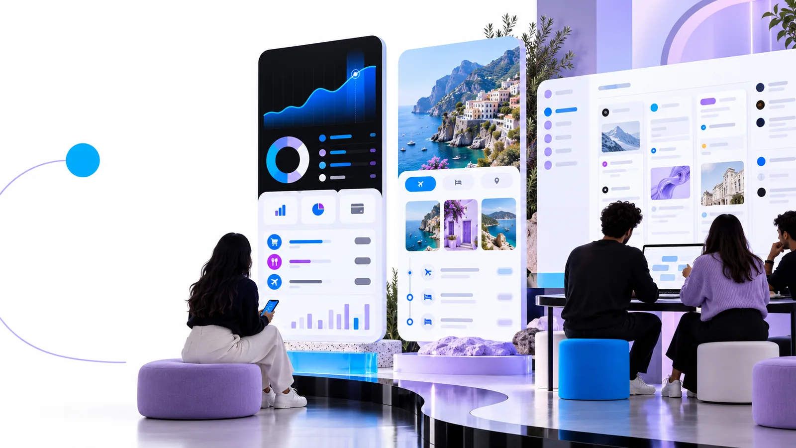
A collection of visual design concepts arranged on a canvas

What this scenario must deliver

A useful concept makes the main task, its context, and its boundaries visible. These limits keep an attractive screen from standing in for a workable mobile experience.

1

Not a tested interaction

A screen concept cannot show whether people understand a gesture, notice an error, or recover after a failed action.

What to do instead

Write the task as a short sequence, then ask someone unfamiliar with the concept what they would tap next.

2

Not a native app

Visual app design does not produce installed Android or iOS software, device permissions, or working notifications.

What to do instead

Document the intended behavior separately and review platform requirements before development.

3

Not a substitute for real content

Perfect sample names and short labels can hide cramped layouts, empty states, and unusually long information.

What to do instead

Try realistic text, missing data, and an error message before settling on a layout.

Each item starts with a task

Move from a specific situation to a small set of screens. Give every step a reason to exist before adding polish.

  1. 1

    Choose a moment

    Describe the user, their goal, and where they are. A commuter checking a delayed route needs a different first screen from someone planning a trip at home.

  2. 2

    Sketch the shortest path

    List the first screen, the decision it supports, and the result screen. Put optional settings and secondary information outside that path.

  3. 3

    Stress-test the screens

    Check one-handed reach, readable text, slow connections, and what happens when there is no result. Revise the flow before refining color or illustration.

Quality bar

Compare an attractive first sketch with a concept ready for a practical review. Each row gives you something observable to check.

First sketch Review-ready concept
Primary action Competes with several equally prominent buttons. One next action is clear for the user's immediate goal.
Navigation Every feature appears on the first screen. The main task stays visible; secondary routes have predictable labels.
Text Short placeholder labels make everything seem to fit. Realistic names, amounts, and instructions remain readable.
Feedback Only the ideal success screen is shown. Loading, empty, error, and success states explain what happened.
Touch Controls look precise at presentation size. Important controls are comfortably tappable on a phone.
Context Assumes full attention and a reliable connection. The flow survives interruptions and makes uncertain data clear.

Common rework, by situation

These examples show where a promising mobile concept often needs a second pass. Use the linked path when that kind of rework becomes your main focus.

Daily commuter

A transit screen shows an elegant route map, but the next departure is buried below it.

Move departure time, disruption status, and the next useful action above the map. Keep the map available for orientation rather than making it the first task.

app design ideas

Household organizer

A shared grocery list looks tidy until several people add long item names and notes.

Test crowded rows, completed items, and conflicting edits. Keep adding and checking off items easier than managing categories.

mobile app design templates free

Local volunteer

An event check-in concept assumes every attendee has a strong signal and can read a dense form outdoors.

Make the attendee's status legible at a glance and plan what the interface should say when information cannot be refreshed.

free app design for android

Independent creator

A portfolio concept leads with animations, while visitors mainly want to find one project and make contact.

Prioritize project scanning and a clear contact route. Let visual expression support the content instead of delaying it.

how to design ui for an app

Take one concept further

Choose one situation from the examples or write your own in a sentence. App Design can point you toward a browser-based starting path; check the destination's available tools and terms before assuming a particular feature or output.

Start with the task, then shape the screen

  • Name the user's immediate goal.
  • Keep the first path short.
  • Review states beyond success.
Explore the workflow

Scenario FAQ

Start with a recurring situation rather than a visual style: who needs to do what, and under which constraints? Sketch the first action and the useful result before choosing colors or collecting references.

A phone is often used in short, interrupted sessions with limited space for competing choices. A mobile concept should make the immediate task easy to spot and check that controls, text, and feedback work at phone size.

Include enough screens to show the start, a meaningful decision, and the outcome. Add an empty or error state if it changes what the person must do; a large screen collection is less useful than a coherent path.

It can reveal unclear labels, crowded screens, and missing steps, but it cannot prove usability or implement native behavior. Test the task with people and review technical and platform requirements before treating the concept as a finished app.

Start designing
Start designing